

The end of the day in a restaurant looks, for most managers, pretty much the same: a quick glance at the sales figure, a rough calculation of the average check, and that’s it. The system has recorded everything, the data is there, but no one has read past the final total. The next day, the same decisions are made again on instinct: how many people to put on the shift, what promotion to run, which dish to drop from the menu.
The problem is not that data is missing. It is that there is no habit of using it. A daily sales report tells you the day happened, not whether it was a good day or one hiding a problem. Sales can look fine overall and conceal an evening that compensated for a disastrous lunch, a server with poor performance, or a dish being sold at a loss.
Your restaurant’s reports hold concrete answers to the questions you face every day: why did Tuesday sales drop, which server brings in the highest average check, which dish sells well but carries a relatively thin profit margin. This article explains how to read that data, what decisions each type of report can drive, and how to move from numbers to actions.
Why Available Data Goes Unused
There are three reasons why restaurant reports go unchecked, even though they are available every day. The first is volume: a modern POS generates dozens of report types, and a manager who does not know where to start will largely ignore all of them, not just some. The second is lack of context: raw data without comparison to a previous period says nothing actionable. If a dish was ordered 40 times yesterday, you do not know whether that is a lot or a little until you compare it with the average of recent weeks. The third is the absence of a fixed review rhythm: reports read sporadically, without a defined timeframe, do not reveal trends, and trends are the only thing that turns a number from a mere observation into a signal for action.
The solution is not to read more reports. It is to read a few essential reports consistently and to know what decision each one can trigger.
The Four Levels of Data Analysis
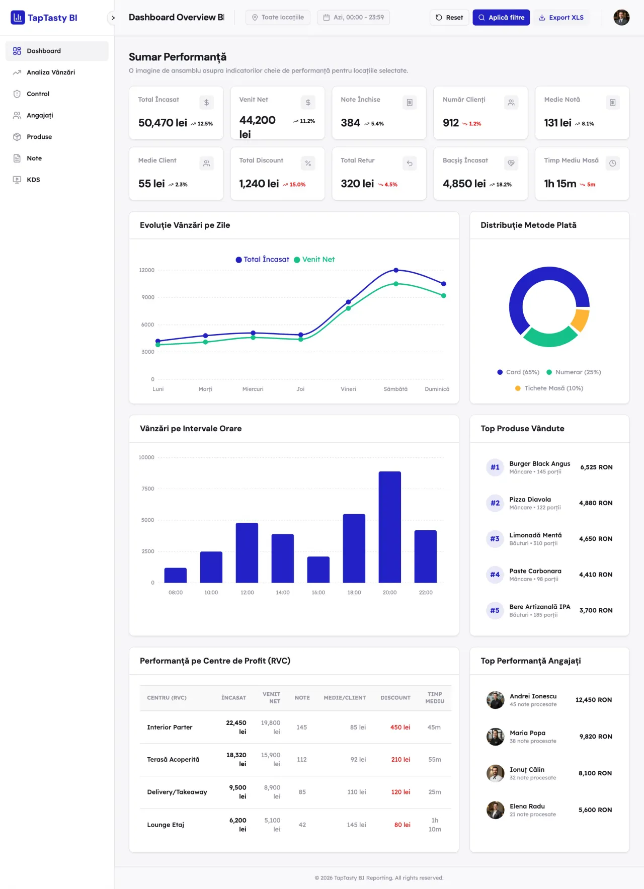
Sorbey describes four levels of analysis applicable to restaurants, each answering a different question. The first level, descriptive, answers “what happened?”: yesterday’s sales, the number of orders, the average check. Almost every restaurant already does this without calling it analysis. The second level, diagnostic, goes further and asks “why did it happen?”: if Tuesday evening sales fell by 15%, the data helps identify the cause, whether a popular dish was removed, a lower-performing server was on shift, or the peak period was shorter than usual. The third level, predictive, uses historical trends to estimate future demand, and the fourth, prescriptive, suggests an action based on available data, which is exactly what the AI assistant in TapTasty BI does when it identifies a deviation and points to the report where you should look for the cause.
Independent restaurants typically work at the first two levels, which also happen to have the most direct operational impact.
Sales Reports: Where the Real Information Is Hidden
Sales reports are the starting point for any analysis, but a daily or weekly total without breakdown is of little use. What matters are the distributions within that total.
Sales by time slot show the real peak hours, not the perceived ones. Many managers believe they know when the restaurant gets busy, but data frequently reveals peaks of 15 to 20 minutes during hours considered “normal.” This information shapes staffing: if the real Thursday evening peak is between 7:30 and 8:15 PM, there is no point having the full team in from 6:00 PM.
Sales by channel show where every dollar comes from, whether in-venue orders, online orders through the mobile app or website, orders through the self-ordering kiosk, or orders through aggregators. If 40% of sales come through aggregators and 15% directly, you have a profitability problem that does not show up in the total figure, because the margin per aggregator order is significantly lower than on a direct order. Sales by payment method, though less discussed, are useful for reconciliation and for identifying discrepancies between what the system records and what actually reaches the till. The TapTasty POS automatically generates sales reports across all of these dimensions, in real time, with no manual compilation work.
Menu Reports: High Sales Volume Does Not Always Mean High Profit
This is probably the most valuable type of report in a restaurant, and at the same time the most frequently ignored. RestroFood puts the central principle of menu analysis simply: a dish sold 80 times a week may generate less profit than one sold 30 times, if the latter has a better margin. That is the entire equation.
Menu analysis classifies dishes by two variables simultaneously: sales volume and contribution to profit. From their combination, four categories emerge, each requiring a different action. Dishes with high sales and a good margin are the stars of the menu: they deserve to be promoted actively, positioned prominently, and protected from recipe changes that would affect their cost. Those with a good margin but low sales are candidates for repositioning within the menu or for visibility campaigns, because the profit potential exists but customers are not discovering them enough. Dishes with high sales but a thin margin need a pricing or recipe cost analysis, because they attract traffic without contributing proportionally to profit. And those with low sales and a thin margin are candidates for removal, freeing up space in the menu and simplifying kitchen operations.
TapTasty BI includes this classification in the products and menu module, updated in real time. Category rankings, slow-moving dishes, and the incidence of a product in the average order are all visible without needing to build tables manually.
Team Reports: Each Server’s Performance in Numbers
Team reports are often avoided by managers because nobody wants to appear as if they are monitoring staff with suspicion. But performance data is not a control tool. It is a training tool and a way to organise work more effectively.
Average check per server shows who actively recommends additional dishes and who does not. A server with a consistently lower average check than the team average may benefit from a focused training session on recommending dishes, rather than a generic conversation about motivation. The speed of order processing and the error rate, meaning cancellations or modifications after an order has been sent to the kitchen, reveal who has difficulties with the system or the workflow. If one server has a significantly higher error rate than their colleagues, the context deserves investigating rather than assuming bad faith.
TapTasty BI provides a detailed view of team performance: how many active bills each server has, what revenue they have generated, how their order structure compares to the average, and what discounts they have applied. The manager can compare performance across the same shift or across similar shifts, with enough context for the data to be interpretable rather than purely numerical.
Kitchen Reports: Where Time Is Being Lost and Why
A type of data available in restaurants with a KDS (Kitchen Display System), but systematically overlooked, is kitchen performance data. Preparation times by station, by dish, and by time slot show where bottlenecks occur and at what hour.
If the average preparation time for a dish increases by 40% between 7:00 and 8:30 PM compared to the rest of the evening, it is a signal that the relevant station is overstretched during that window. The solution might be reassigning a kitchen assistant or adjusting ingredient prep before service. If a dish consistently has the longest preparation time and generates the most frequent complaints about waiting, it may be worth reviewing the recipe or reconsidering its place in the menu. A dish that takes 25 minutes to prepare is better suited as a main course at dinner than as a quick lunch option.
TapTasty BI includes KDS analysis with preparation times by station, dish, and peak period, including instances where estimated times are exceeded. This visibility allows the manager to intervene before a speed problem starts reaching the customer.
POS Audit: The Exceptions That Should Not Be Ignored
One of the most valuable features in a restaurant’s reports is the POS operational audit. Every order cancellation, every return, every discount applied, and every table transfer is recorded with the time, the server, and the context. Looked at individually, these events seem trivial. Looked at together, across periods and across staff members, they can reveal patterns worth paying attention to.
A higher cancellation rate for a particular server compared to the average is not an accusation, but a signal worth investigating. It may be that they make frequent entry errors, that they are dealing with a system issue, or that there is a situation of another kind altogether. TapTasty BI correlates these signals and generates a risk score per employee, with the explicit weighting of each factor, so that the manager can understand why a particular profile has appeared, not just that it has. The decision of whether to act or not remains entirely with the manager who knows the real context.
The AI Assistant for Questions You Did Not Know How to Ask
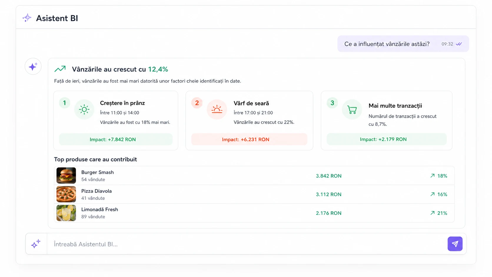
All of the data described above is available in structured reports. But there is another way to access the information in your restaurant’s reports: through questions asked directly, in plain language, in TapTasty BI.
The platform’s AI assistant answers concrete questions about the restaurant’s data: which were the best-selling dishes last week, where are the biggest discrepancies between locations, what influenced the drop in sales last Thursday. The answer comes from real data and opens the relevant report for further detail. This is not a feature of the future. It is available now, and it significantly reduces the barrier to accessing data for managers who are not accustomed to navigating complex dashboards. If you know how to phrase a question, you know how to access the data.
How Often You Should Review Your Reports
A simple and practical framework for reviewing restaurant reports starts from three distinct rhythms. Daily, in five to ten minutes, it is worth tracking sales against the same day of the previous week, the average check, and the number of orders by channel. That’s all. Enough to detect whether something has deviated significantly from normal and to avoid being caught off guard at the end of the month.
Weekly, in about half an hour, you go into more detail: what sold and at what margin, team performance by average check and error rate, preparation times from the kitchen, and exceptions from the POS audit. This is the real operational management framework, the one that allows timely adjustments rather than after-the-fact reactions.
Monthly, with an hour or two set aside, you analyse trends against the previous month and the same month of the previous year, review the menu classification, compare prices against current ingredient costs, and evaluate the impact of any marketing campaigns run during the period.
Conclusion
Your restaurant’s reports are not a tool for accounting for the past. They are a tool for planning the immediate future. Yesterday’s sales tell you what to prepare today. Last week’s team performance tells you where to focus training. Preparation times from the kitchen signal where to adjust the flow before problems reach the customer.
The data already exists in the system. The difference between a restaurant that uses it and one that does not is not one of technology or resources. It is one of habit: which reports you open, how often, and whether you extract a decision from them or merely a confirmation that things are going more or less fine.